
Building a Brand

Brand Identity: Strovia
THE REQUEST
In the crowded growing space of medical marijuana where there is still a stigma, companies are looking for ways to show the legitimacy of marijuana in the medical field. Strovia, a brand entering this space, approached Rev One for help to develop their brand.
They wanted their brand to look and feel like a legitimate producer of cannabis-based products that help people with their ailments, and not a recreational drug company. Strovia wanted their identity to be simple and clean, with a pharmaceutical feel.
THE WORK
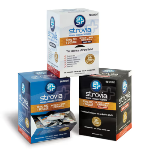
Strovia had already developed a logo. We took that as our starting point and gave it a refresh. We rounded the edges and smoothed corners to present a friendlier feel. We adjusted spacing between letters so the word mark felt more even and balanced. We created a symbol that complemented the word mark by combining the letter S, representing the company name, and seamlessly joining it with a plus symbol, which is associated with medicine. We chose colors from the blue family because of its associations with reliability, responsibility and trust.
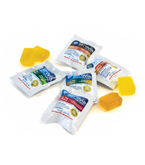
The refreshed logo gives the impression of a professional, trustworthy company that creates high-quality products. Once we established the logo, we developed the Strovia look and feel and extended it onto their point-of-sale materials, including various packaging, posters, print ad and informational postcard.

Want to learn more? We’d love to show you what we can do.
Curious about our services but don’t know where to start? Schedule a discovery call with us to learn more about our process and how we can tailor our services offered to your specific project needs.
View Services

